Borne out of the founder’s Gen-Z children entering the working world, Shroomies needed help designing and developing their brand.
The wellness space is crowded with natural supplements. From CBD to retinol, we’re constantly being introduced to ‘new’ magical ingredients, generally targetted at older demographics. But what about the generation entering the workplace now?
The wellness space is crowded with natural supplements. From CBD to retinol, we’re constantly being introduced to ‘new’ magical ingredients, generally targetted at older demographics. But what about the generation entering the workplace now?
Creative Strategy, Graphic Design, Art Direction, Client Liaison, Pitch Documents, Style Guide, Adobe Illustrator, Adobe InDesign, Adobe Photoshop, Adobe AfterEffects
shroomies.co.uk ︎
shroomies.co.uk ︎

You’ve finished college or university, you’re trying to find work, you want to start your career, earn a living, secure a place to live... But you also want to be spontaneous. What about friends? What about travel? What about health? The stress and anxiety of modern life can often feel restricting, rendering us unable to focus, think clearly, let go, be free.
Enter Shroomies: the natural way to feel ok.

BRAND IDEA
Inspired by a bygone era of free love, we look to the ‘70s for all that this generation knows of it. Marijuana, psychadelics and mushrooms were all the rage. Rewind to a time of record players, Gameboys and the all important, Lava Lamp.
Though we use gradients and textures created by the “lava” in these eponymous lamps, Shroomies leans on a more modern approach fo all other graphical elements. Targeting Gen Z, we needed the branding to be bold, accessible and fresh. Through our product offering – which stays firmly routed in the wellness space – we bring an appealing proposition to this generation.
Though we use gradients and textures created by the “lava” in these eponymous lamps, Shroomies leans on a more modern approach fo all other graphical elements. Targeting Gen Z, we needed the branding to be bold, accessible and fresh. Through our product offering – which stays firmly routed in the wellness space – we bring an appealing proposition to this generation.


PACKAGING ARTWORKING
We introduce a fun naming convention that appeals to the Gen-Z target demographic. Starting with 2 SKUs for launch, there is GET SHIT DONE: a day capsule for concentration and a pick-me-up, and CHILL THE F OUT: a night capsule for decompressing and promoting a better quality of sleep.
Given that these products are achored in the wellness space, we were conscious that the core packaging should still appeal to holistic wellness retailers as well as the demographic. Though specific gradients were created per product – and can be used across marketing communications – we were more reserved of its use on the core packaging.
Given that these products are achored in the wellness space, we were conscious that the core packaging should still appeal to holistic wellness retailers as well as the demographic. Though specific gradients were created per product – and can be used across marketing communications – we were more reserved of its use on the core packaging.


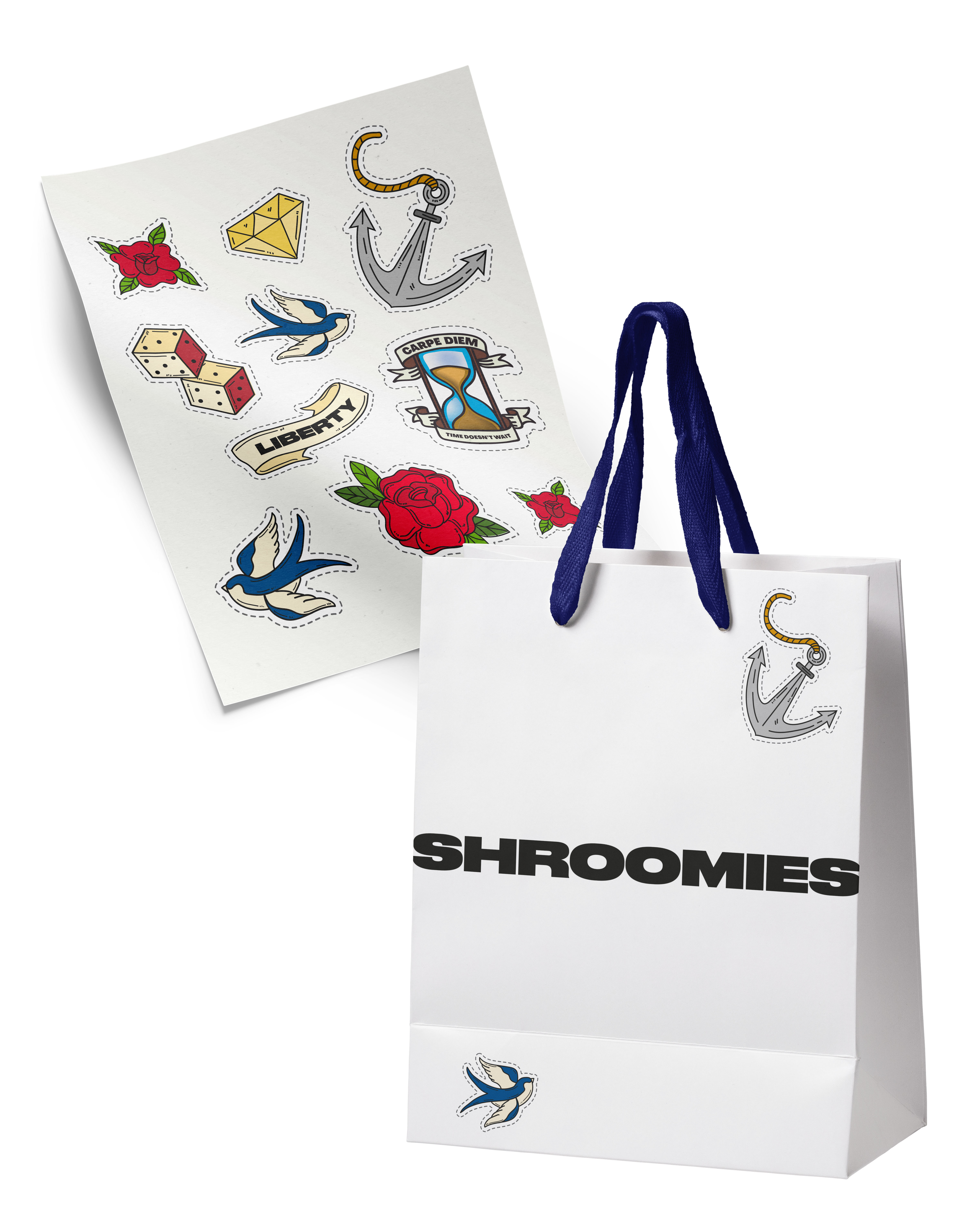

ADDITIONAL GRAPHICS ASSETS
ART DIRECTION
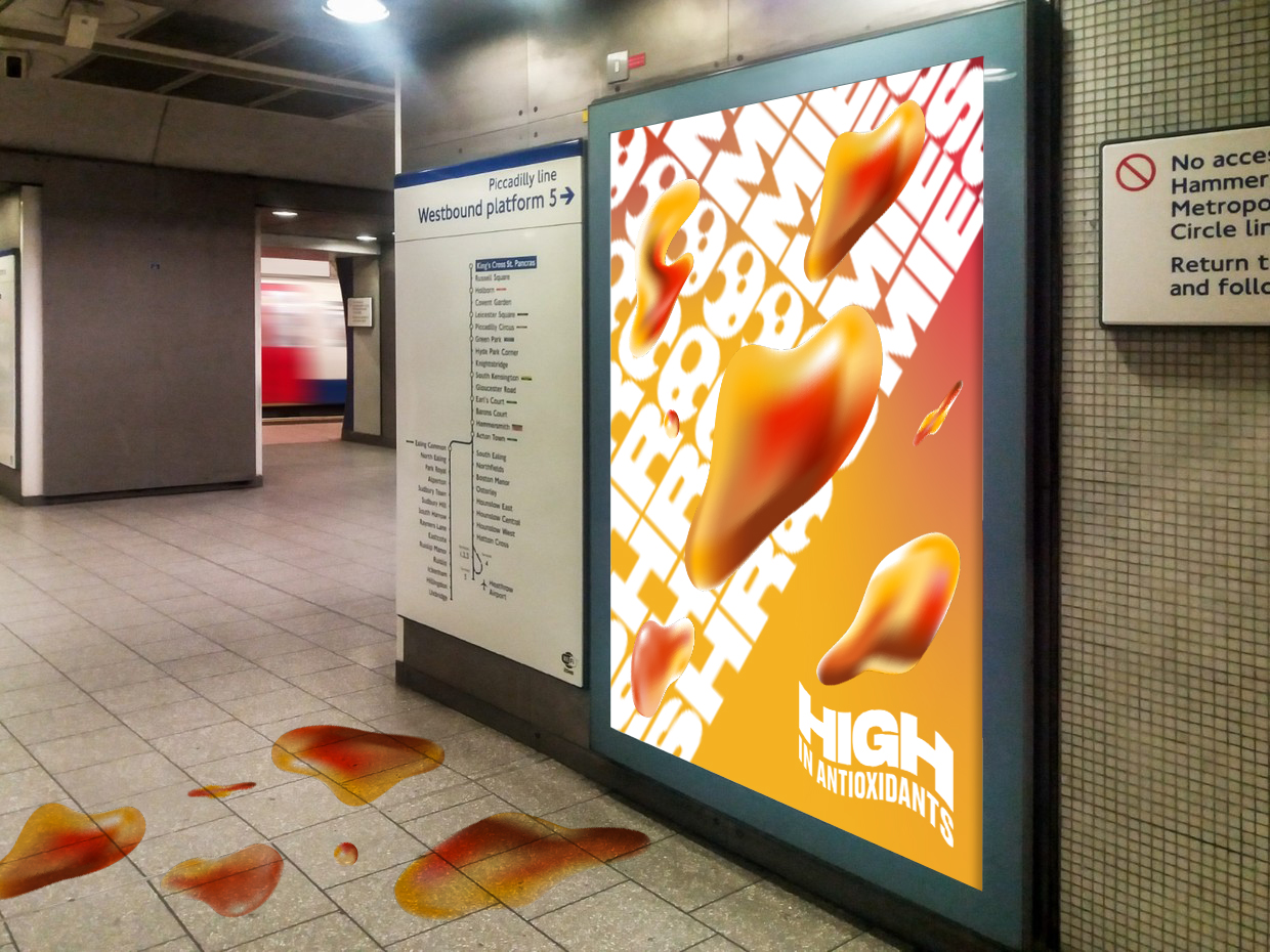
OOH CONCEPTS
We also looked at developing a moving roundel as a graphic asset to ham home the tagline. These can be updated depending on seasons, calendar events and/or collaborations.
Ensuring we target the right demographic, we look at the graphic and type treatment around OOH ad concepts. Additional graphics were also sourced and created for a robust set of assets that could be used across marketing channels for a fun and accessible approach to wellness.
ADDITIONAL GRAPHICS ASSETS
ART DIRECTION
OOH CONCEPTS
ART DIRECTION
OOH CONCEPTS
We also looked at developing a moving roundel as a graphic asset to ham home the tagline. These can be updated depending on seasons, calendar events and/or collaborations.
Ensuring we target the right demographic, we look at the graphic and type treatment around OOH ad concepts. Additional graphics were also sourced and created for a robust set of assets that could be used across marketing channels for a fun and accessible approach to wellness.
Ensuring we target the right demographic, we look at the graphic and type treatment around OOH ad concepts. Additional graphics were also sourced and created for a robust set of assets that could be used across marketing channels for a fun and accessible approach to wellness.