With today’s customer being more savvy than ever before, Playboy were keen to shift the needle on their brand strategy to become more inclusive and empowering. The collaborations and partnerships we were putting forward for them were much more discerning, creating a value proposition that aligned with the modern world as well as their original lifestyle offering.
Creative Strategy, Graphic Design, Art Direction, Partnership Management, Client Liaison, Licensing & Brand Extension, Pitch Documents, Style Guide, Adobe Illustrator, Adobe InDesign, Adobe Photoshop
As Featured In: CAA ︎
PlayHard Seltzers ︎
As Featured In: CAA ︎
PlayHard Seltzers ︎


CREDENTIALS
CLIENT MANAGEMENT
We created top line credentials on Playboy’s behalf as well as supporting strategy documents and decks for partnership and sales outreach. Presented in their tone of voice and brand, this was a way to entice potential partners and get them excited about where Playboy were going.
CREDENTIALS
CLIENT MANAGEMENT
CLIENT MANAGEMENT
We created top line credentials on Playboy’s behalf as well as supporting strategy documents and decks for partnership and sales outreach. Presented in their tone of voice and brand, this was a way to entice potential partners and get them excited about where Playboy were going.


A celebration of the vintage world of Playboy, these cans can become collectible art pieces in themselves. The focus is on the archive magazine cover, evident in the tight cropping and complete wrap of the artwork around the can. Added detail in the flavours’ dedicated colour allows for ease of selection for the customer as well have impact on shelf.


CREATIVE STRATEGY
PITCH DECKS
As part of Playboy’s outreach, we created Point-of-View (POV) documents to justify and inspire any given category – and to ultimately excite potential licensees. All these documents were modular by nature so that the Business Development and Sales teams could leave sections in or take them out based on the scope of any particular operator and the conversations they were having.
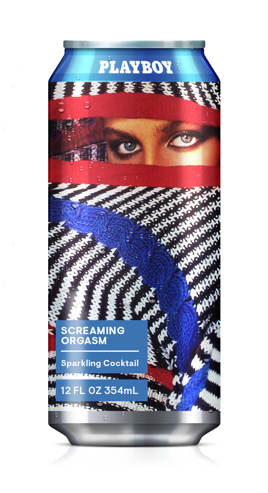
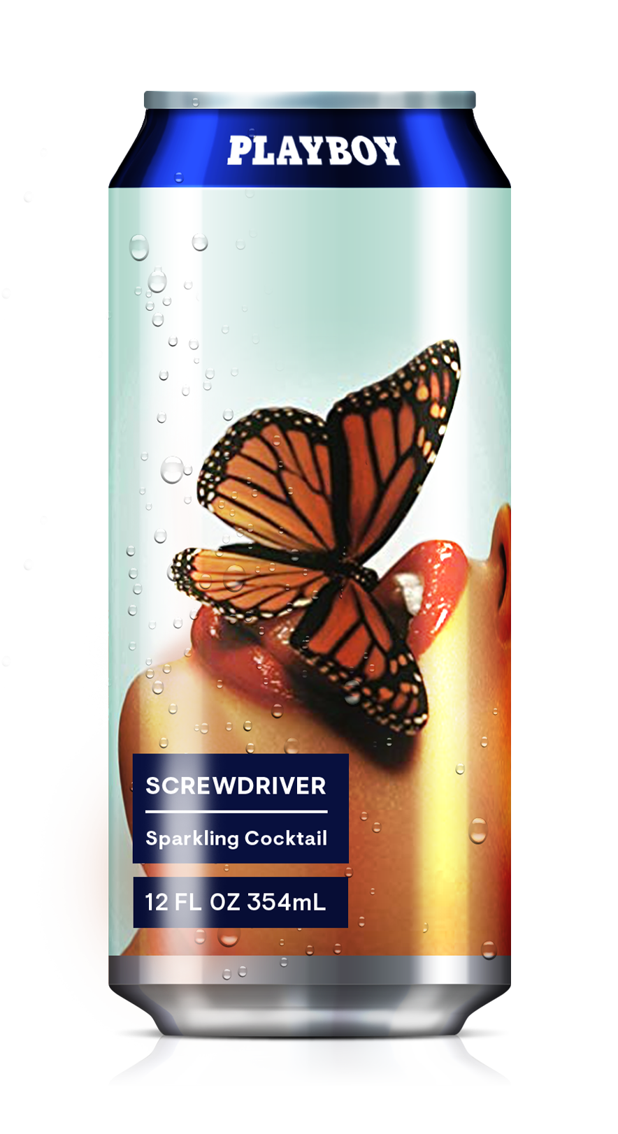
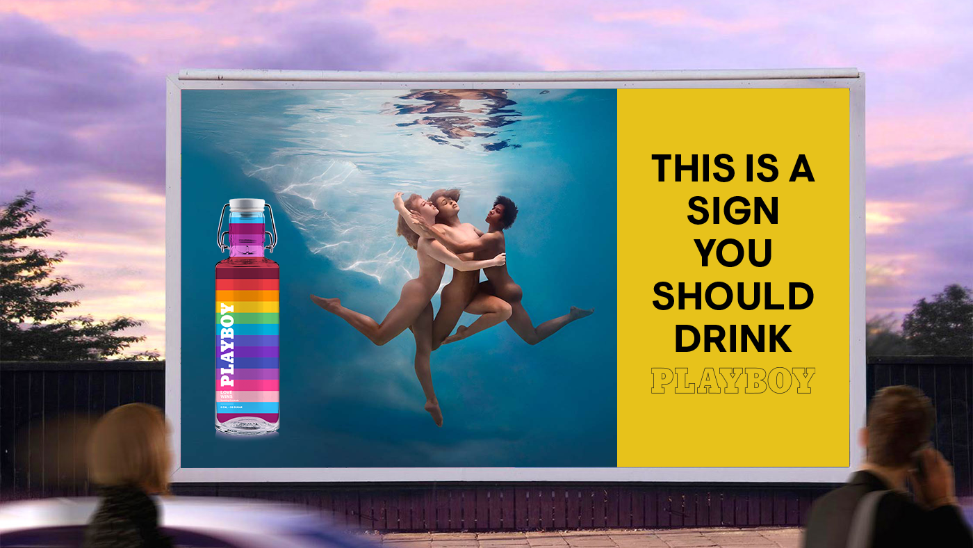
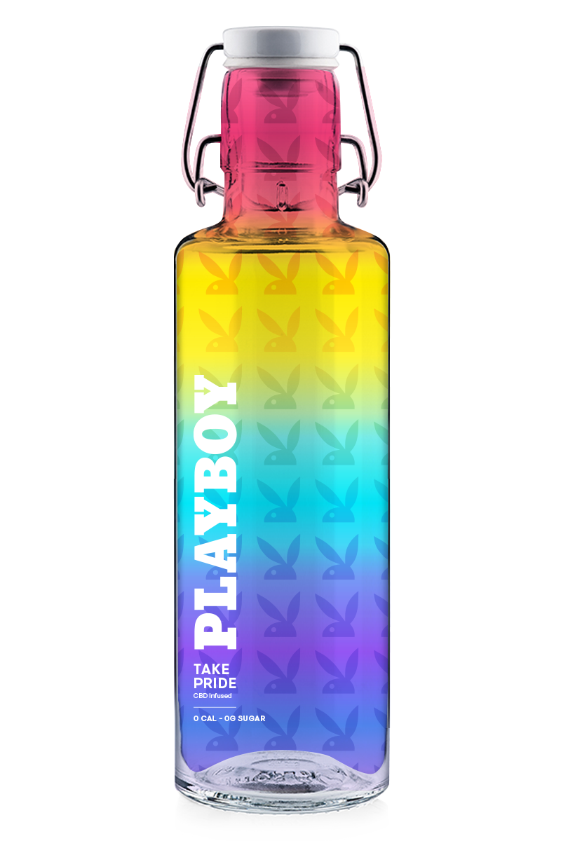
With a robust set of graphics – heritage imagery, vintage covers, photography, bespoke artwork through the times – we had a lot of visual stimuli to work with. The task here was to create rules in order to safe guard the use of Playboy’s assets. Using the Ready to Drink outreach as an example, we created a set of rules around each beverage type: heritage artwork was used across all canned cocktails; beers leaned on a wholly typographic approach; handdrawn illustrations for non-alcoholic beverages; gradients were used for CBD beverages; and all things rainbow for a Pride capsule collection.
CREATIVE STRATEGY
PITCH DECKS
PITCH DECKS
As part of Playboy’s outreach, we created Point-of-View (POV) documents to justify and inspire any given category – and to ultimately excite potential licensees. All these documents were modular by nature so that the Business Development and Sales teams could leave sections in or take them out based on the scope of any particular operator and the conversations they were having.
With a robust set of graphics – heritage imagery, vintage covers, photography, bespoke artwork through the times – we had a lot of visual stimuli to work with. The task here was to create rules in order to safe guard the use of Playboy’s assets. Using the Ready to Drink outreach as an example, we created a set of rules around each beverage type: heritage artwork was used across all canned cocktails; beers leaned on a wholly typographic approach; handdrawn illustrations for non-alcoholic beverages; gradients were used for CBD beverages; and all things rainbow for a Pride capsule collection.
With a robust set of graphics – heritage imagery, vintage covers, photography, bespoke artwork through the times – we had a lot of visual stimuli to work with. The task here was to create rules in order to safe guard the use of Playboy’s assets. Using the Ready to Drink outreach as an example, we created a set of rules around each beverage type: heritage artwork was used across all canned cocktails; beers leaned on a wholly typographic approach; handdrawn illustrations for non-alcoholic beverages; gradients were used for CBD beverages; and all things rainbow for a Pride capsule collection.

